News   Feb 05, 2024
 1K     0 
News   Jan 27, 2020
 1.9K     0 
News   Nov 14, 2019
 2K     0 

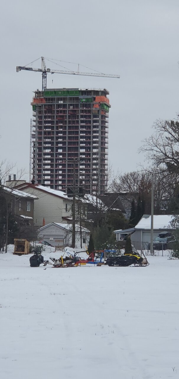
Azure Westboro | 2070 Scott St. | 83.4m | 26s | Azure | BDP Quadrangle

View from the SJAM Parkway winter trail.
20240204_123634.jpg
 
I like how thin this one looks from the east and west. Quite a few windows are in on the podium now.

IMG_3239.jpeg

IMG_3238.jpeg
 
I walk my dog by here whenever I feel like a longer loop. I've been waiting impatiently for a brick delivery for either this or their other build on Winona, both of which look to be very close to ready for them.
 
I like how thin this one looks from the east and west. Quite a few windows are in on the podium now.
Agreed. We don't see towers that narrow in Ottawa.

The beauty with the Scott towers is that the blocks are narrow so they are all free standing. No future projects next door, so no blank walls, no continuous clump of towers with the same height like Downtown or Rideau. The Western skyline (Bronson to Lincoln Fields area) will look far better than the Eastern skyline (Rideau River to Bronson) with more varied designs, height, space between towers that will let air and light through.
 
I love how slender this one is from the side. The dark glass on the podium looks great. I'm also happy to see more buildings frame around the mechanical penthouses in Ottawa these days.

View attachment 542618
love this shot. the builds coming up in westboro / tunneys are becoming my favourite. look at richcraft's building in the back, that's great stuff!!!
 
I love how slender this one is from the side. The dark glass on the podium looks great. I'm also happy to see more buildings frame around the mechanical penthouses in Ottawa these days.

I agree. Framing the mechanical penthouse should be a new standard. Old Union Station is ruined by the cheap metal cladding of the penthouse. Claridge Moon is made worse by it.
 
I agree. Framing the mechanical penthouse should be a new standard. Old Union Station is ruined by the cheap metal cladding of the penthouse. Claridge Moon is made worse by it.
I'm really worried about Les Terrasses. The reno-renders look like to show it keeping those ugly brown tin penthouses on top of the new glassy buildings.
 
Looks like an office building. And does look like the fins have been removed or are significantly reduced - removing the 1 design feature that was originally interesting.
 
Yeah I wish we were getting the original version. But a nearly all-glass tower will still look nice there, I think.
 
I think I'm still seeing the waves in the fins, like the original rendering. Just not quite as obvious.

1710182913763.png


Looks like the mechanical penthouse will be quite obvious and ugly though. Reserving my judgement for the final product.

Also, here's the 2013 proposal. Should make us all feel good about whatever that final product may be.

1710183046286.png
 
From a couple of days ago while walking in the area. Looking good! But I don't see any fins or waves.
1710184373342.png
 
One thing I've noticed about this tower that the 17th floor is taller than all the other floors. Seems to be reflected in the new render if you look close and I've never seen other towers designed that way.
 

Back
Top