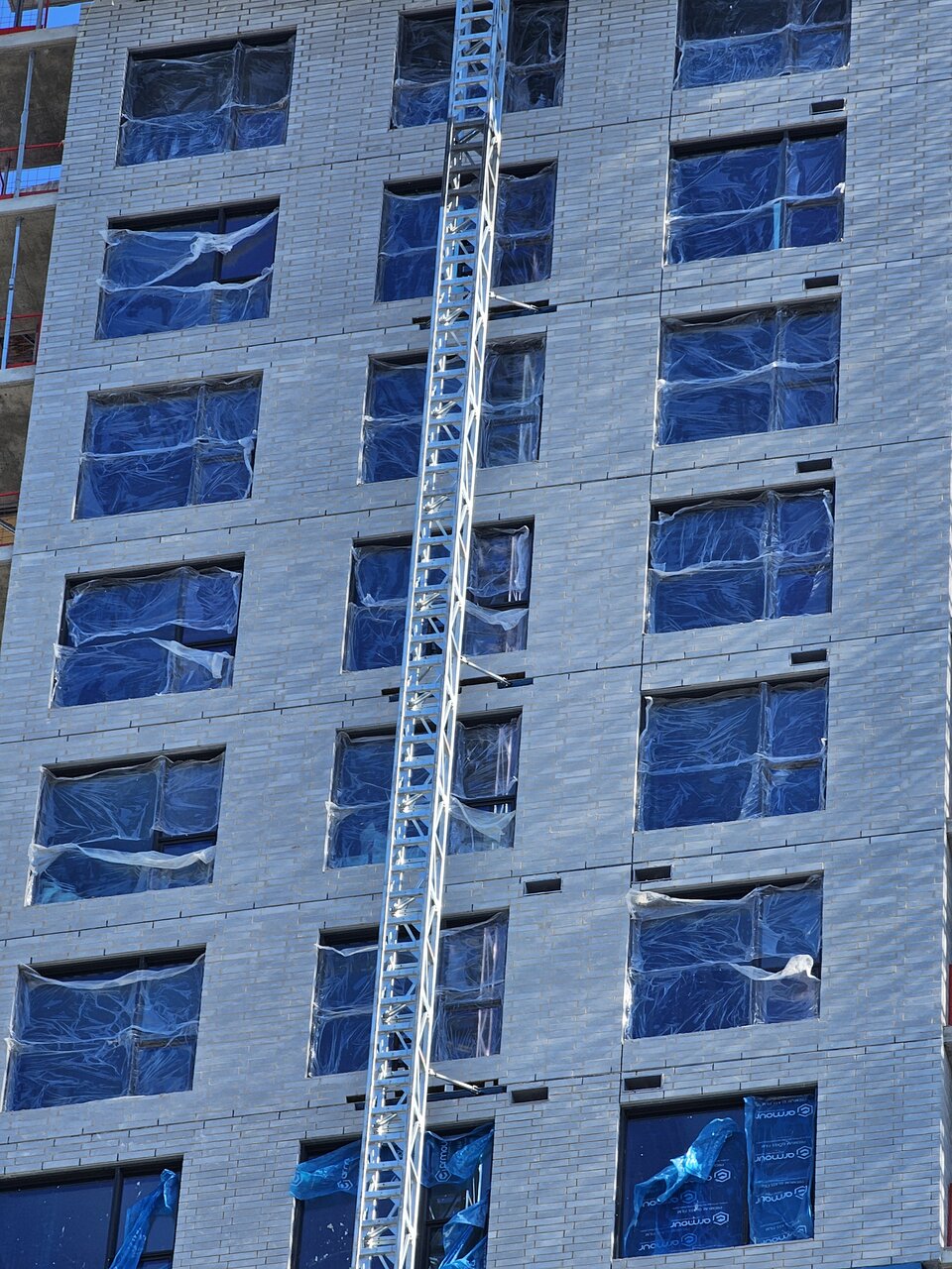
I frickin knew it! I think it will end up looking quite nice, something different for Ottawa. The windows look far flusher than the average charcoal slab tower in Ottawa.
You are using an out of date browser. It may not display this or other websites correctly.
You should upgrade or use an alternative browser.
You should upgrade or use an alternative browser.
The East Flats Phase IV-V | 86m+102m | 25s+30s | Claridge | EVOQ
- Thread starter SRC Admin
- Start date
Pwat_
New Member
I'm sure Harley is on his way with the drone as I upload this, but heres some pics of the new brick in sunset lighting, looks quite nice!
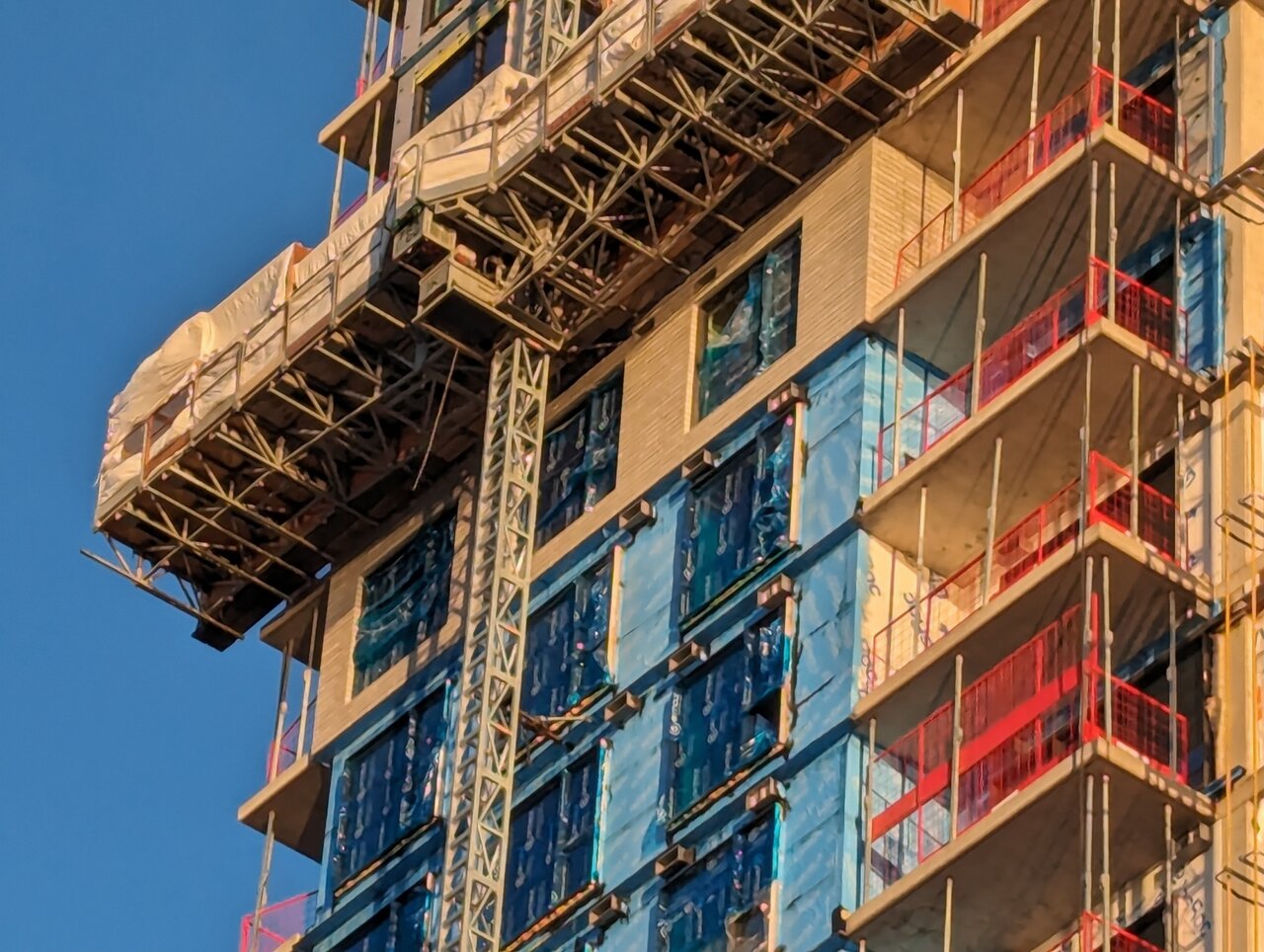
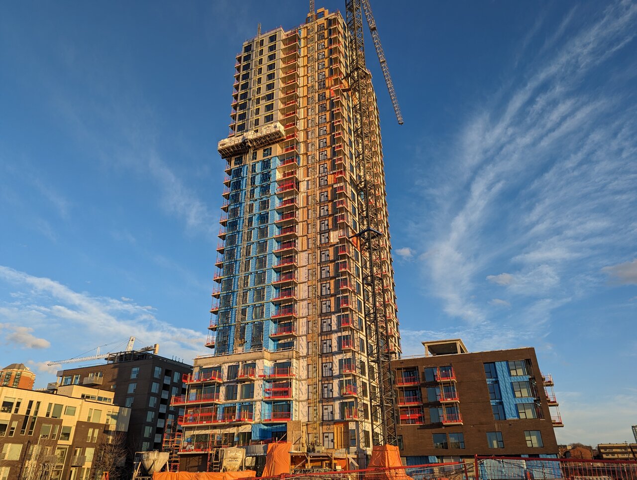
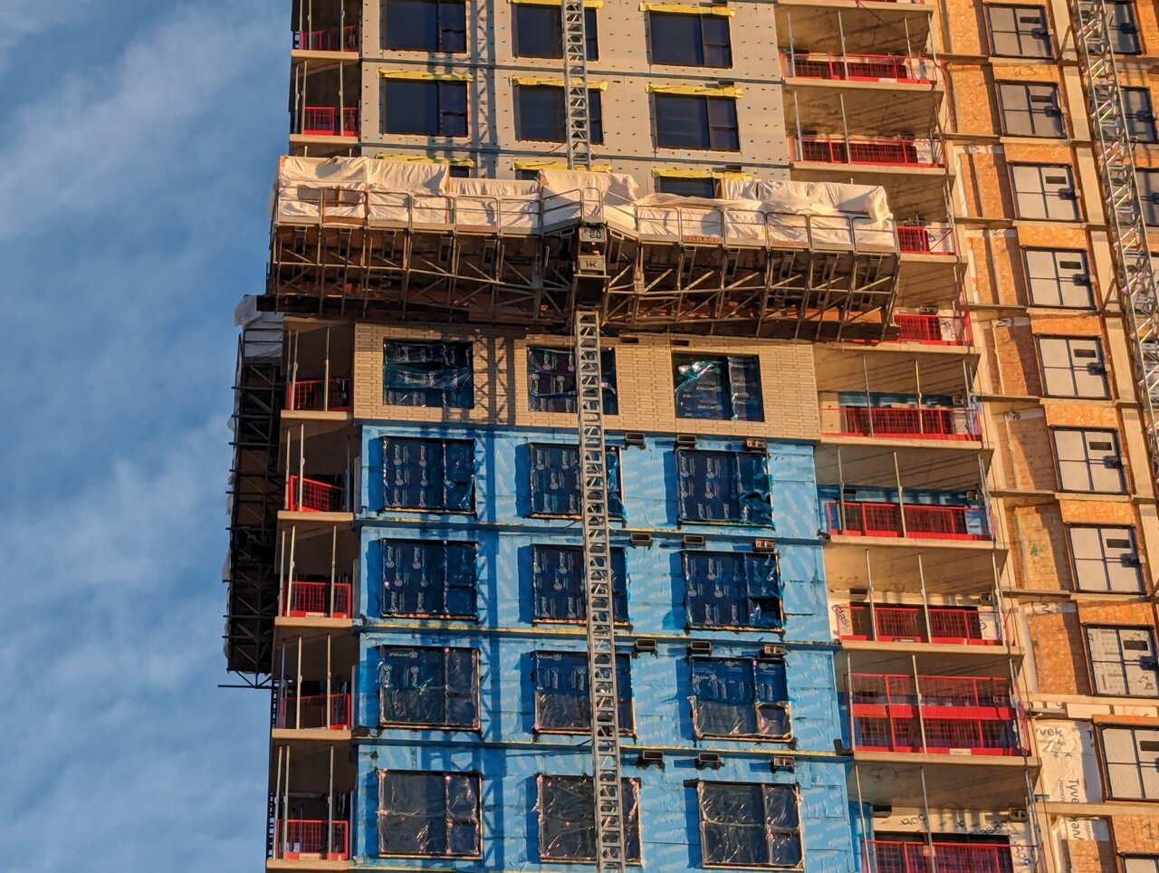
If the entire tower is clad with that, no random patches and crosses of dark brick of metal, it should look pretty nice.
Looks like they've done zero progress since a couple weeks ago.
I'm really digging this brick now. It's something totally new for Ottawa.
originalmuffins
Active Member
Looking good Claridge, lookin pretty damn good.
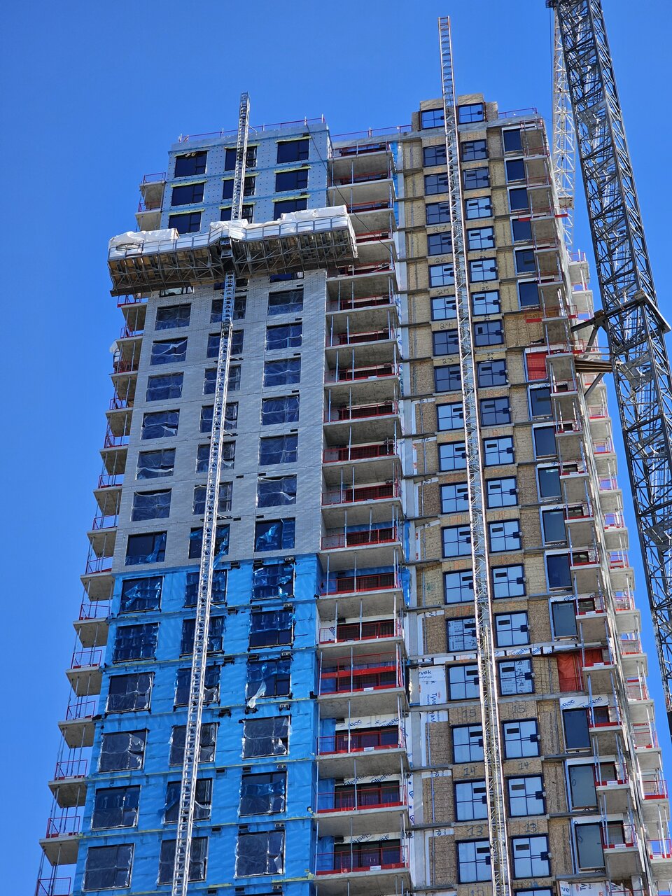
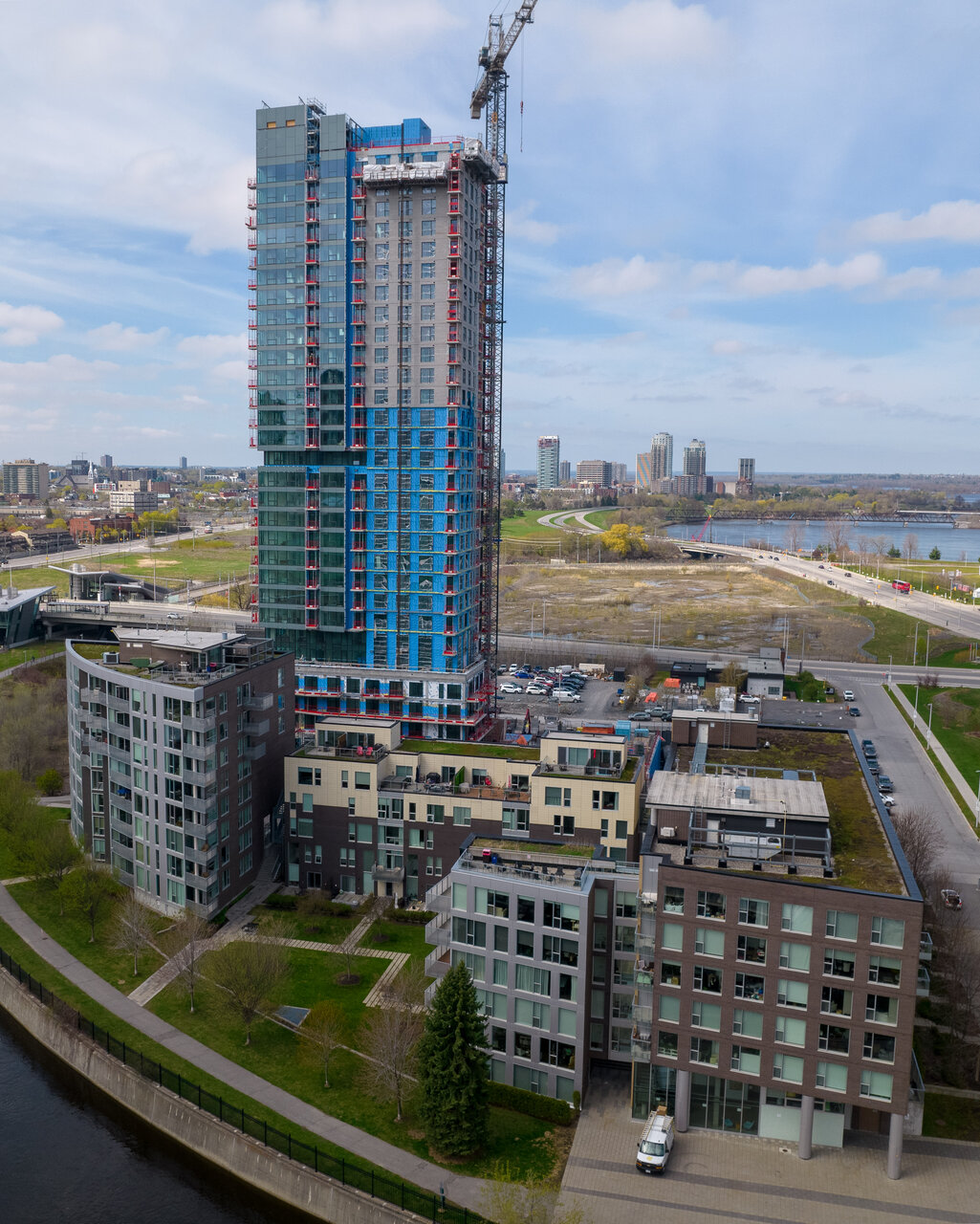
I really like what I'm seeing so far. I only realized today that the curtain wall is flared out, not square to the rest of the facade!!
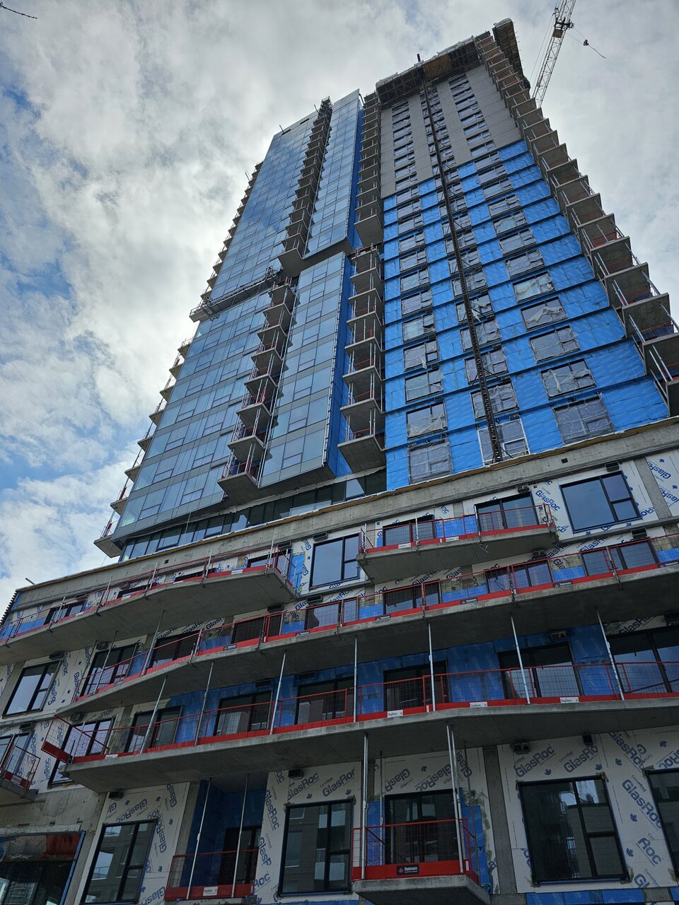
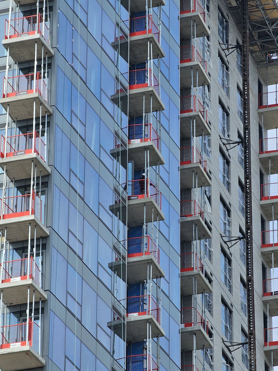
The tower portion looks quite nice. Wish Moon would have adopted this design.
I've really gone 180 on Moon since Releve took shape. I find it's slabbiness to be a nice contrast to Releve, offering a nice variety of architecture and built form on one corner.The tower portion looks quite nice. Wish Moon would have adopted this design.
Moon really blends in to the skyline with its shades of grey. Not offensive in any way. From ground level, it's really not too bad. I agree, the contrast is interesting.I've really gone 180 on Moon since Releve took shape. I find it's slabbiness to be a nice contrast to Releve, offering a nice variety of architecture and built form on one corner.
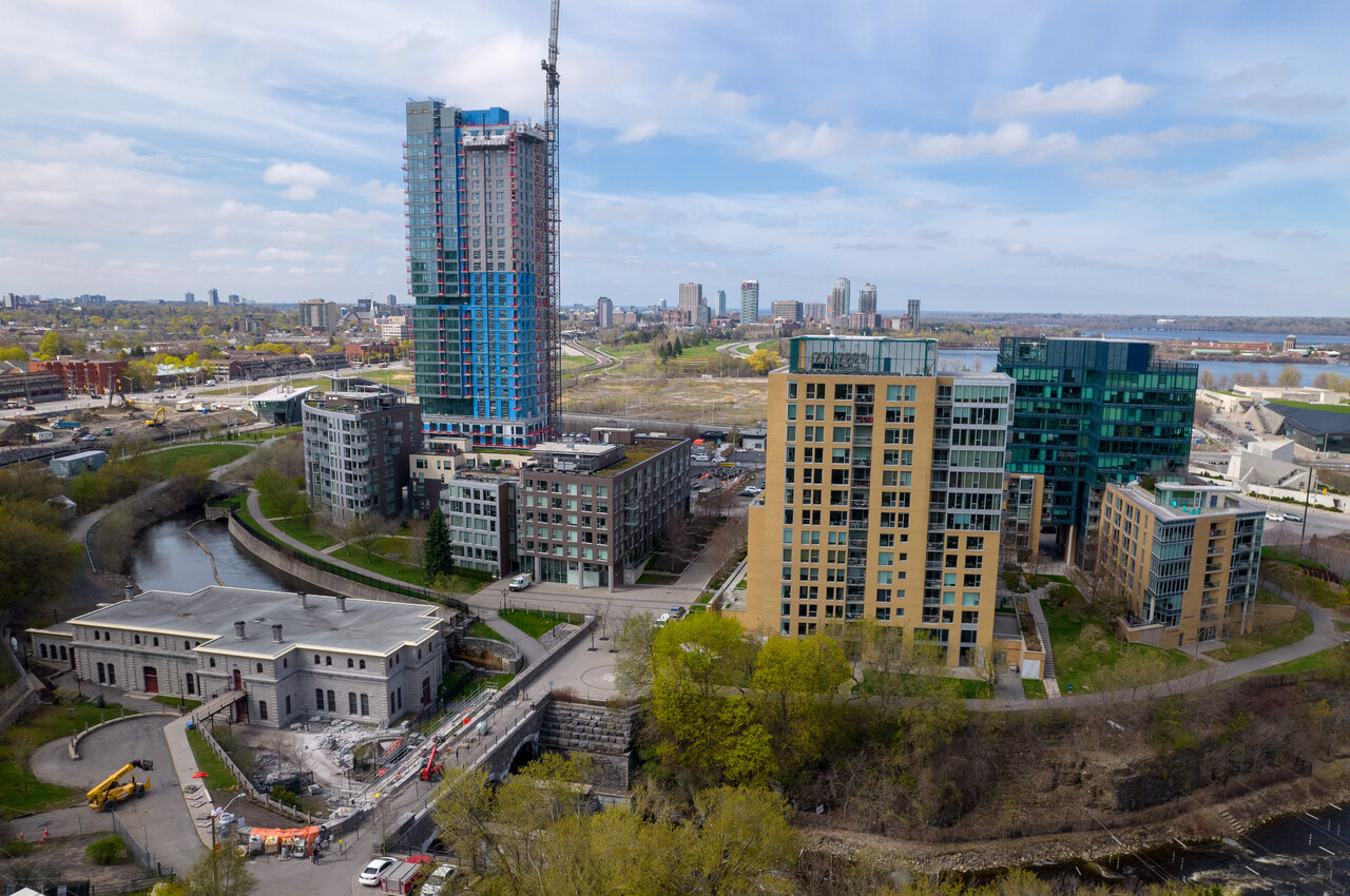
A couple of nice angles form this afternoon:
btap
Active Member
That glass curtain looks great from a distance
It appears in some renders as if the second tower might get a glass corner facing the War Museum.That glass curtain looks great from a distance
Fingers crossed!
The placement of the glass corners was well thought out by Claridge/EVOQ, having them on the most visible faces of each tower.It appears in some renders as if the second tower might get a glass corner facing the War Museum.
Fingers crossed!